, fast delivery, and backed by our world-class customer service every step of the way.
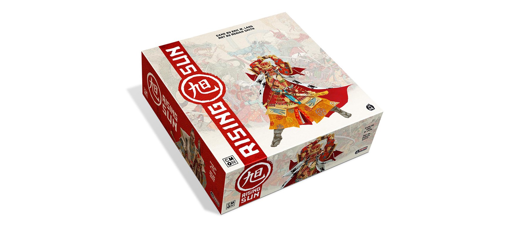
 Back
Back

A Quick Guide to Packaging Design
As of March 31, 2017, the Kickstarter board game project Rising Sun has raised $3,369,482 from 25,666 backers. The vast majority of these backers have yet to play, let alone hold, a physical copy of the game. That’s a lot of money raised for a little board game that’s yet to reach shelves. Originally launched with a $300,000 goal, Rising Sun lapped expectations, becoming a phenomenon among the table-top community. And while we could dedicate this entire blog to what led to the developer’s success, we’ll keep things concise by turning to one major contributor: packaging.
The colorful collages, deep reds and altogether stunning illustrations present a board game that’s going to look striking on the shelf. What’s more, the customized boxes evoke motion and excitement—precisely what one expects from the gameplay. When funding Kickstarter projects, backers are often drawn first and foremost to presentation. In many cases, particularly with board game projects, it’ll be a year, if not longer, before the final product arrives at their doorsteps. This means that presentation must communicate a commitment to quality. Rising Sun’s packaging does this in spades.
YOUR PACKAGING’S IMPACT ON CONSUMERS
How you get the most out of your product’s packaging ultimately depends on what you’re selling. When it comes to “low-risk” products (i.e. low-priced food products such as canned tomatoes), packaging may be the be all and end all. The consumer may simply reach for the most colorful packaging in the aisle. On the other hand, your brand might need to resonate with something a little more complex. Perhaps your packaging needs to respond to potential consumer concerns or quickly distinguish itself from its competitors...
For a little inspiration, we turn to two examples of custom folding boxes. Both do excellent jobs reinforcing their brands but in strikingly different ways.
PUTTING THE PRODUCT FIRST: SOYLENT

When the meal replacement company launched in 2013, it took a big chance naming its health product after the infamous science fiction snack made from people. It’s almost as through the brand were playfully taunting us, suggesting that its product was so effective that it could call itself anything it wanted. Soylent, somewhat like Apple, places the full emphasis on the product itself. Which is why, when it came to packaging, the company settled on a clean, stripped down design. The product packaging features the brand name, a two- to three-word description of what the product is (“powdered food,” “ready-to-drink food,” etc.) and its nutritional value.
Soylent’s packaging makes no claims, it uses no flashy colors or graphics to catch our attention. It simply presents us with an objective overview of the product. This objectivity evokes a commitment to quality, the product’s natural ingredients and its ease of use.
Of course, as effective as Soylent’s packaging is, it’s not unfair to ask whether it would perform as well if featured on retail shelves (Soylent can only be purchased through its website or Amazon). Great packaging design needs to figure in a number factors including where the product is displayed.
STANDING APART FROM THE CROWD: ROUGE GORGE

When Quebec apple farm and cider mill Domaine Lafrance decided to develop an apple vermouth, ad agency Polygraphe had the tricky task of reintroducing an old-fashioned, slightly out of trend alcohol to a younger demo. On its website, Polygraphe describes its thought process behind the design:
“We used the return of neglected classics as the narrative background…We chose to represent the product’s emblem—the robin—in a paint-by-numbers-style landscape, which echoes a bygone era while revealing the product’s playful personality.”
The striking paint-by-numbers design is us featured in a blue not normally found on fortified wines or other spirit packaging. The inviting reds, displayed upon a white label (perfectly contrasted by the dark bottle) draws your eyes to the design and lets the brand pop from the shelf. The packaging sets the product apart from other vermouth bottles, which are often overlooked by Rouge Gorge’s target demo. It leaves us asking “what’s that?”
A HELPFUL CHECKLIST
When developing your packaging design, there are volumes to consider. That said, there are always four simple steps that we encourage our clients to think about. Ensure you cover all these bases before moving forward with finalizing anything, for more information on the vast packaging industry, check out this online course.
Explore different packaging formats: Does your packaging maximize shelf space? If you're shipping your products, can the package withstand damage? Design a mailer box and test it out! As we discussed in our last post about subscription boxes, it’s always useful to request a sample order from your packaging company before committing to one. Be sure to explore different finishes as well; custom corrugated boxes don’t look the same nor perform the same as a rigid boxes, they both have their strengths and weaknesses that depend on how they will be used.
Don’t forget the details: Remember that your packaging may need to include legal text, nutritional info, expiry dates, barcodes, etc. And while these elements aren’t part of your branding, they’re still very much part of the package and need to be incorporated in a manner that’s aesthetically pleasing (think about how Soylent uses the nutritional chart in a way that’s almost indistinguishable from the brand design).
Develop branding guidelines: Should the logo always appear on a flat color or can it overlay an image? Will you need different typesets or color palettes for different packaging formats? A big part of developing branding guidelines is determining what DOESN’T work. The process really helps you think about how others are going to interact with your product.
Hire a pro: Even if you’ve agonized for months over our packaging design and are confident that you’re ready to print, don’t move forward without having a pro graphic designer at least look your work over. We haven’t even touched upon technical specs such as dielines, color modes and different printing techniques. Having a pro in your corner will not only ensure you have everything accounted for but also award you with print and design options you may not even know you have. Objectivity is best so try to reach outside of your social circle and seek advice from someone who won’t hesitate to critique honestly.